
Python 연습장
Python Visualization(5) - seaborn 본문
seaborn은 matplotlib보다 더 예쁘고 간편하게 그래프를 그릴 수 있어서 많은 사람들이 선호하는 시각화 툴이다.
모든 사람들이 pandas를 pd로 불러오는 것처럼 seaborn도 sns로 불러온다. 왜 sns 인지 궁금해서 알아보니까 The West Wing이라는 드라마에 나왔던 캐릭터 이름이 Samuel Norman Seaborn 이래서 앞글자 따서 sns로 불러온다고 한다. 하하..
seaborn에서는 sklearn처럼 dataset을 따로 불러올 수 있다. 이번 포스팅에서는 sns의 데이터셋으로 그래프를 그려볼 것이다.
seaborn에서 dataset 불러오기
import seaborn as sns

df = sns.load_dataset("penguins")
penguins dataset 외에 다른 dataset도 불러올 수 있는데, 데이터셋 종류는 sns.get_dataset_names()로 확인할 수 있다.
iris 랑 titanic 도 확인 가능하다. sklearn에서 dataset 불러오는 것보다 훨씬 간편한 것 같다.
아래는 seaborn 에서 확인 가능한 데이터셋 종류와 shape, 그리고 column 명을 정리한 테이블이다.
| dataset | shape | columns |
| anagrams | (20, 5) | ['subidr', 'attnr', 'num1', 'num2', 'num3'] |
| anscombe | (44, 3) | ['dataset', 'x', 'y'] |
| attention | (60, 5) | ['Unnamed: 0', 'subject', 'attention', 'solutions', 'score'] |
| brain_networks | (923, 63) | ['network', '1', '1.1', '2', '2.1', '3', '3.1', '4', '4.1', '5', '5.1', '6', '6.1', '6.2', '6.3', '7', '7.1', '7.2', '7.3', '7.4', '7.5', '8', '8.1', '8.2', '8.3', '8.4', '8.5', '9', '9.1', '10', '10.1', '11', '11.1', '12', '12.1', '12.2', '12.3', '12.4', '13', '13.1', '13.2', '13.3', '13.4', '13.5', '14', '14.1', '15', '15.1', '16', '16.1', '16.2', '16.3', '16.4', '16.5', '16.6', '16.7', '17', '17.1', '17.2', '17.3', '17.4', '17.5', '17.6'] |
| car_crashes | (51, 8) | ['total', 'speeding', 'alcohol', 'not_distracted', 'no_previous', 'ins_premium', 'ins_losses', 'abbrev'] |
| diamonds | (53940, 10) | ['carat', 'cut', 'color', 'clarity', 'depth', 'table', 'price', 'x', 'y', 'z'] |
| dots | (848, 5) | ['align', 'choice', 'time', 'coherence', 'firing_rate'] |
| exercise | (90, 6) | ['Unnamed: 0', 'id', 'diet', 'pulse', 'time', 'kind'] |
| flights | (144, 3) | ['year', 'month', 'passengers'] |
| fmri | (1064, 5) | ['subject', 'timepoint', 'event', 'region', 'signal'] |
| gammas | (6000, 4) | ['timepoint', 'ROI', 'subject', 'BOLD signal'] |
| geyser | (272, 3) | ['duration', 'waiting', 'kind'] |
| iris | (150, 5) | ['sepal_length', 'sepal_width', 'petal_length', 'petal_width', 'species'] |
| mpg | (398, 9) | ['mpg', 'cylinders', 'displacement', 'horsepower', 'weight', 'acceleration', 'model_year', 'origin', 'name'] |
| penguins | (344, 7) | ['species', 'island', 'bill_length_mm', 'bill_depth_mm', 'flipper_length_mm', 'body_mass_g', 'sex'] |
| planets | (1035, 6) | ['method', 'number', 'orbital_period', 'mass', 'distance', 'year'] |
| taxis | (6433, 14) | ['pickup', 'dropoff', 'passengers', 'distance', 'fare', 'tip', 'tolls', 'total', 'color', 'payment', 'pickup_zone', 'dropoff_zone', 'pickup_borough', 'dropoff_borough'] |
| tips | (244, 7) | ['total_bill', 'tip', 'sex', 'smoker', 'day', 'time', 'size'] |
| titanic | (891, 15) | ['survived', 'pclass', 'sex', 'age', 'sibsp', 'parch', 'fare', 'embarked', 'class', 'who', 'adult_male', 'deck', 'embark_town', 'alive', 'alone'] |
histogram plot
import matplotlib.pyplot as plt
import seaborn as sns

df = sns.load_dataset("penguins")

plt.figure(figsize=(8,3))
plt.subplot(131)
df['bill_length_mm'].hist()
plt.title('df.hist()')
plt.subplot(132)
plt.hist(df['bill_length_mm'])
plt.title('plt.hist()')
plt.subplot(133)
sns.histplot(df['bill_length_mm'])
plt.title('sns.histplot()')
plt.tight_layout()
plt.show()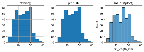
기존에 histogram 그리던 방법과 비교해보기 위해서 차례대로 그려봤는데, seaborn 은 알아서 xlabel, ylabel을 나타내 주고 line까지 그려주니까 보기에 더 편하다.
scatter plot
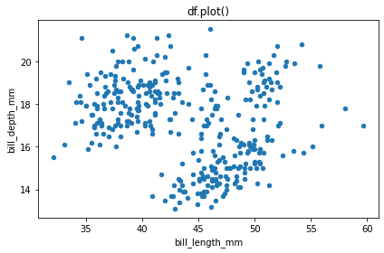
무슨 버그인지 모르겠는데 위의 hist 처럼 scatter plot을 함수 별로 그려보면 pandas 내장 함수 plot 그래프가 안 나온다. 따로 그려보면 나오기는 하는데 이유를 모르겠다.
import pandas as pd
import matplotlib.pyplot as plt
import seaborn as sns

df = sns.load_dataset("penguins")

plt.figure(figsize=(8,3))
plt.subplot(131)
# df.plot(kind='scatter',x='bill_length_mm', y='bill_depth_mm')
plt.title('df.plot()')
plt.subplot(132)
plt.scatter(df['bill_length_mm'],df['bill_depth_mm'])
plt.title('plt.scatter()')
plt.subplot(133)
sns.scatterplot(x=df['bill_length_mm'],y=df['bill_depth_mm'])
plt.title('sns.scatterplot()')
plt.tight_layout()
plt.show()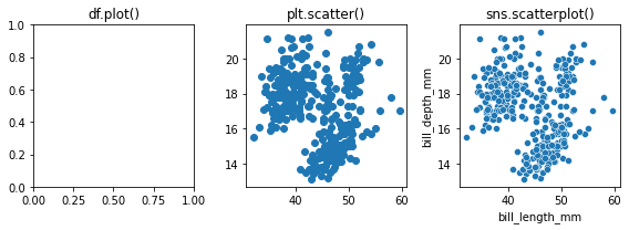
bar plot
역시 scatterplot과 마찬가지로 subplot으로 그리면 pandas 내장함수 bar는 제대로 안 나와서 제외했다.
import pandas as pd
import matplotlib.pyplot as plt
import seaborn as sns

df = sns.load_dataset("penguins")

plt.figure(figsize=(6,3))
plt.subplot(121)
plt.bar(df['species'],df['bill_depth_mm'])
plt.title('plt.bar()')
plt.subplot(122)
sns.barplot(x=df['species'],y=df['bill_depth_mm'])
plt.title('sns.barplot()')
plt.tight_layout()
plt.show()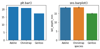
seaborn에서는 이렇게 알아서 예쁘게 색깔을 입혀주는 점이 편하다.
'코딩' 카테고리의 다른 글
| 파이썬 패키지 개념과 pip 간단 명령어 모음 (0) | 2022.01.17 |
|---|---|
| categorical data encoding 방법 (0) | 2022.01.14 |
| pipeline (0) | 2022.01.09 |
| Python Visualization(4) - subplot (1) | 2022.01.06 |
| Python Visualization(3) - matplotlib의 그래프 종류 (0) | 2022.01.04 |

