
Python 연습장
Python Visualization(3) - matplotlib의 그래프 종류 본문
지난 포스팅에서 matplotlib 의 line 그래프와 scatter 그래프에 대해서만 살펴봤는데,
matplotlib으로 그 외에 다양한 그래프들을 그릴 수 있어서 살펴보려고 한다.
먼저, 앞선 포스팅에서와 같이 데이터테이블을 불러온다.
import pandas as pd
from sklearn.datasets import load_iris
iris = load_iris()
df = pd.DataFrame(data = iris.data, columns = iris.feature_names)
df['target'] = iris.target_names[iris.target]
print(df)
pyplot 에서 xlabel이 있어야 데이터를 그릴 수 있는 그래프는 scatter, bar, stem, step 이 있는데, 자주 쓰이는 scatter와 bar에 대해서 보겠다.
matplotlib을 import 해주고 그래프를 하나씩 그리지 말고 subplot으로 묶어서 그려보겠다.
여기서 xlabel은 숫자가 아닌 category를 나타내주는 label로 지정을 해줘야 한다.
import matplotlib.pyplot as plt

plt.figure(figsize = (8,3))
plt.subplot(131)
plt.scatter(df['target'],df['sepal length (cm)'], marker='o', edgecolors ='black')
plt.subplot(132)
plt.bar(df['target'],df['sepal length (cm)'], color = 'skyblue', width=0.3)
plt.subplot(133)
plt.barh(df['target'],df['sepal length (cm)'])
plt.tight_layout()
plt.show()
여기서 tight_layout()을 안쓰면 오른쪽 barh 그래프의 라벨이 중간 bar 그래프와 겹쳐져 버려서 지저분해보이니까 항상 추가해주자.
데이터프레임에서 하나의 컬럼으로만 그릴 수 있는 그래프 타입은 hist, boxplot, pie가 있고 violinplot도 가능하다.
hist 는 df.hist()처럼 bins parameter를 통해서 bin 개수를 조절 가능하다.
pie 같은 경우는 보통 점유율을 나타내기 때문에 dataframe에서 value_counts()로 데이터를 가져왔다. autopct 는 autopercent 의 약자로 점유율을 표시한다. iris dataset 은 각 라벨별로 데이터 개수가 동일하기 때문에 33% 로 나왔다.
%d 는 정수를, %% 는 %를 나타내고 소수 1째 자리까지 나타내려면 '%.1f%%' 으로 쓰면 된다.
plt.figure(figsize = (6,5))
plt.subplot(221)
plt.hist(df['sepal length (cm)'], bins = 10, linewidth=1, edgecolor='white',color='steelblue')
plt.subplot(222)
plt.pie(df['target'].value_counts(),labels=df['target'].value_counts().index, autopct='%d%%')
plt.subplot(223)
plt.boxplot(df['sepal length (cm)'],widths=0.2)
plt.subplot(224)
plt.violinplot(df['sepal length (cm)'])
plt.tight_layout()
plt.show()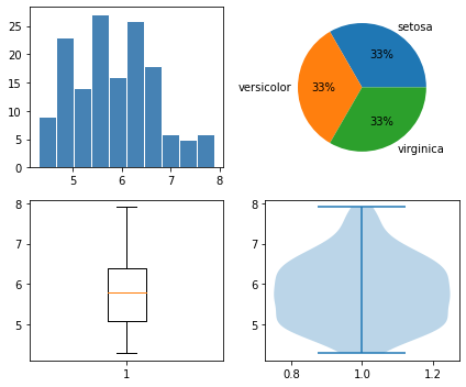
violinplot 을 데이터 프레임 째로 그리면 아래처럼 나타낼 수 있는데 이건.. 원래 boxplot보다 잘 안쓰이는 그래프이기도 하고 seaborn 에서 쓰는 게 라벨링도 알아서 되고 훨씬 간편해서 나한테는 사용빈도가 낮다.
hist2d는 두개 속성의 데이터 밀집도를 간편하게 확인할 수 있다.
plt.figure(figsize = (5,3))
plt.subplot(1,2,1)
plt.violinplot(df[['sepal length (cm)','sepal width (cm)','petal width (cm)']],positions=[1,2,4])
plt.subplot(1,2,2)
plt.hist2d(df['sepal length (cm)'], df['sepal width (cm)'], cmap='Blues', bins=20)
plt.tight_layout()
plt.show()
오늘은 matplotlib 의 그래프 종류와 속성에 대해 간단히 알아보았다. 다음은 subplot 응용편을 포스팅할 예정이다.
'코딩' 카테고리의 다른 글
| pipeline (0) | 2022.01.09 |
|---|---|
| Python Visualization(4) - subplot (1) | 2022.01.06 |
| Python Visualization(2) - matplotlib 기본 (0) | 2022.01.03 |
| 딥러닝 시계열 알고리즘 정리 (0) | 2022.01.01 |
| Python Visualization(1) - Pandas 내장 Plot 함수 (0) | 2021.12.30 |

